Visual Analysis of CO2 Emissions and Human Development Around the World
1. Project overview
What:
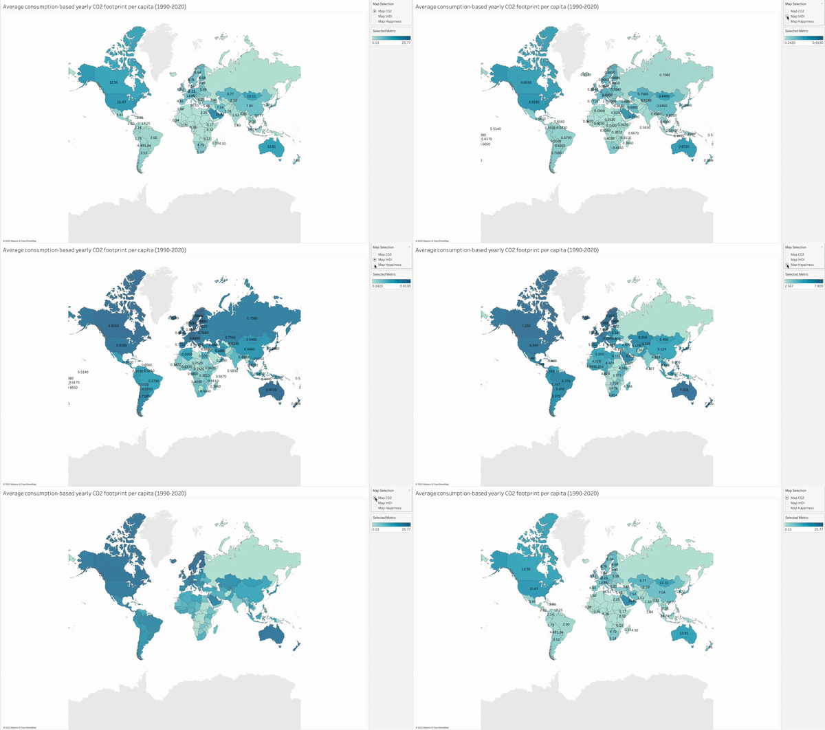
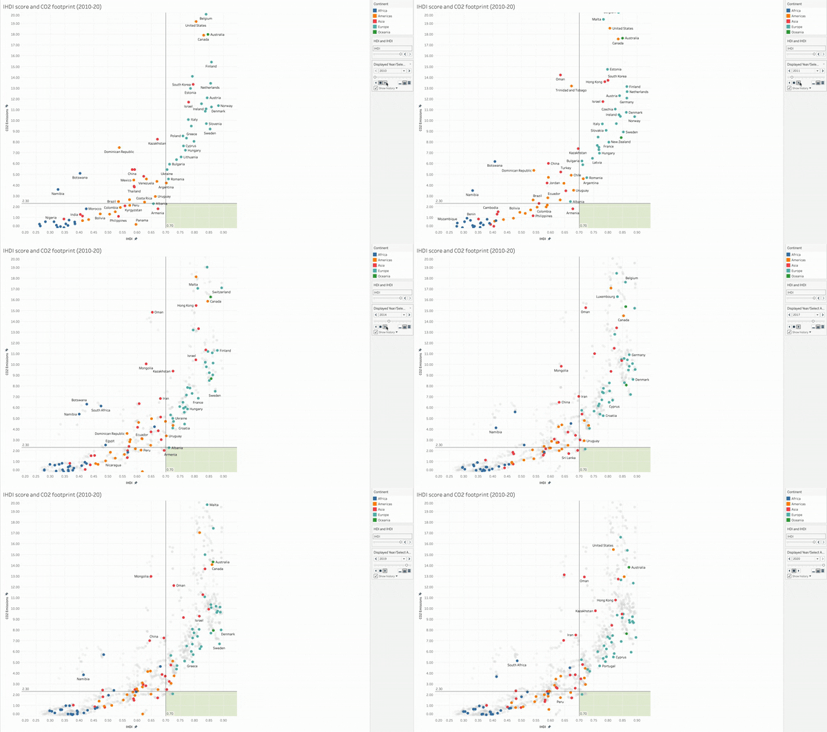
A Tableau Storyboard resulting from the exploration of global emissions, human development and world happiness data.
Why:
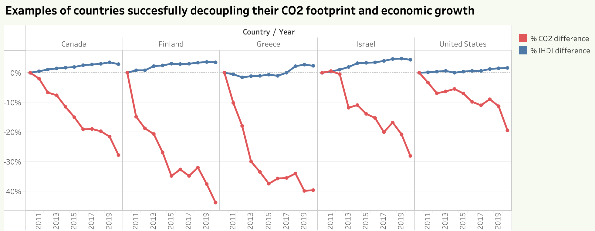
Analysis of countries’ CO2 emissions most commonly use production-based figures, which do not accurately reflect a population’s lifestyle. Furthermore, the success of a country in offering its population a high standard of living is often measured by its GDP or GNI per capita. In order to achieve a more accurate reflection of countries’ emissions and the quality of life of their populations, I decided to base this analysis on the consumption-based CO2 emissions and the human development index instead.
How:
1. Identify publicly available data:
- "CO2 emissions dataset", Accessed from https://ourworldindata.org/co2-dataset-sources on December 20, 2022.
- "Human Development Reports Data Downloads", Accessed from https://hdr.undp.org/data-center/documentation-and-downloads on December 20, 2022.
- "World Happiness Report", Accessed from https://www.kaggle.com/datasets/unsdsn/world-happiness on December 20, 2022.
2. Primarily used Python skills (pandas, seaborn, statsmodels):
- Data wrangling
- Data merging
- Grouping and aggregating data
- Supervised machine learning
- Unsupervised machine learning
- Time series analysis
- Using visualization libraries
3. Data visualization with Tableau to create a storyboard
2. Analyzing and visualizing the data
Bringing the datasets together
The main focus of this step was to clean the three datasets so as to retain only data that is relevant for this project to eliminate any possible noise for the analysis before having a stab at it with machine learning, etc. I then made sure that the country names were identical and in accordance with United Nations nomenclature, before I reshaped all three to long format for easier visualization. Finally, I merged all three datasets into one dataframe as a basis for the analysis.
With the merged dataset at my disposal, I set out to perform some exploratory analysis and visualization of the data in Python.
Data collection for all three datasets is very complex, so each covers a different set of countries over varying timespans. This posed a challenge for the analysis, because the time span we can analyze depends on the variables examined. In order to not confuse the reader, I chose to limit my analysis to CO2 emissions and inequality-adjusted human development index.
Although I enjoyed using machine learning (k-means clustering) on my dataset, it generated no pertinent additional insights in this project.
In view of the time series and geographical nature of the data, visualizations proved a great way to share my insights with readers. But to gain a deeper understanding of the underlying factors at play, qualitative (political) analysis would be required.
Defining a research question
Based on the above, I set out to tackle the following research questions
Creating the Tableau storyboard
I chose the following approach to visualize the data with Tableau:


3. Recommendations and next steps
The projects led me to some interesting insights, which are formulated in more detail in the Tableau storyboard embedded at the top:Next steps:
For a closer look at the Python code please visit my GitHub and feel free to check out the full storyboard at the top of this page.